Vier5
Design Studio
email: contact@vier5.de
instagram: vier5_paris
1. APPEARANCE INSIDE
c) wall texts
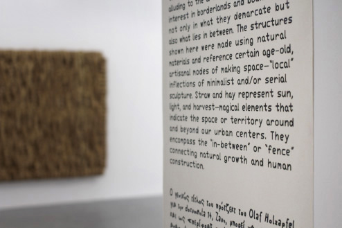
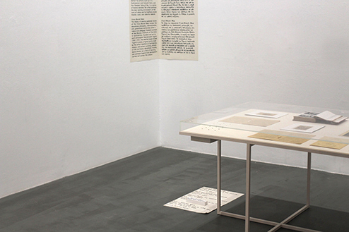
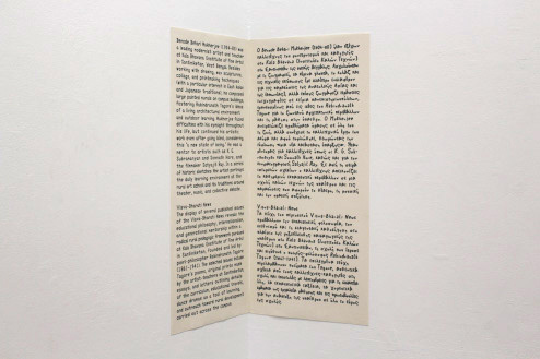
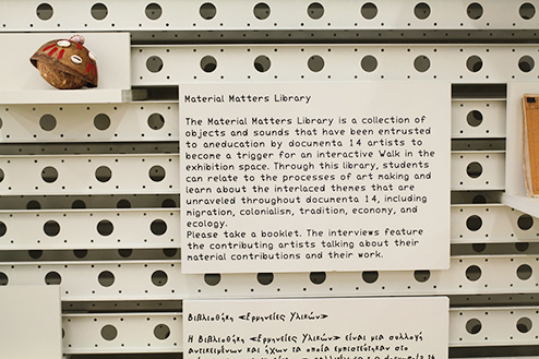
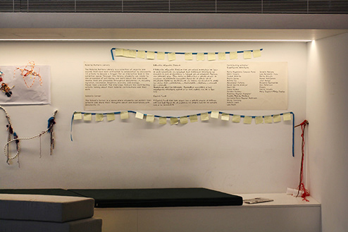
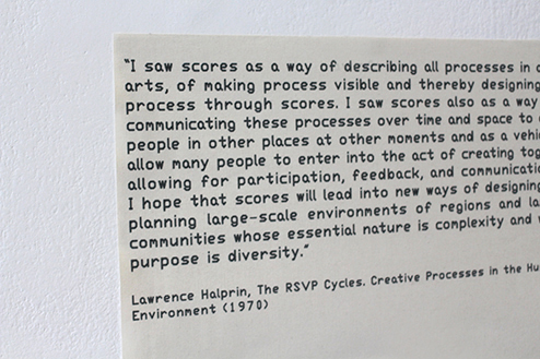
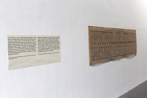
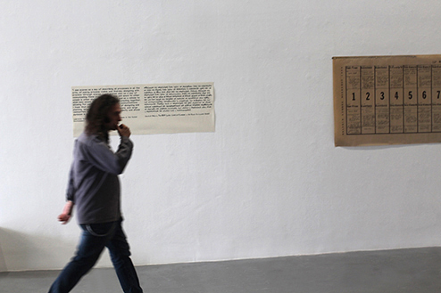
The texts in the exhibiton are printed on canvas
in a light black, like the labels. The texts are in
greek and in englisch.
The texts are always placed near a door or a corner.
They should be near the floor or the ceiling.
They are always linked with the architecture and
near elements of the architecture, like doors,
elevators, windows etc. They are never in the
middle of a wall.
a) irregular circles
b) labels
c) wall texts
d) guards
<

wall texts
wall texts
wall texts
wall texts
wall texts
wall texts
wall texts
wall texts
wall texts
<
>